As we head into the final weeks of 2025, investor relations teams at fund managers are facing a familiar reality: more demands, tighter timelines, and higher expectations from investors who want faster responses, better transparency, and more sophisticated engagement.
Across conversations with IR teams at emerging managers and established firms, one clear pattern emerged: the teams that are thriving aren’t the ones working longer hours. They’re the ones with clarity. Clarity on where requests are stalled, which content is working, where fundraising stands, and what’s actually driving results.
The industry has moved beyond inbox management and scattered spreadsheets. 2026 will be about having the right visibility at the right time in a format that supports faster, smarter decisions.
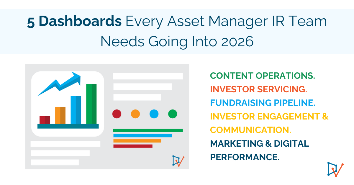
Here are the five dashboards that are foundational going into 2026, and how the right platform transforms each one from reporting exercise into strategic advantage.
1. Content Operations Dashboard
Your command center for everything IR produces: from pitch decks to quarterly letters to DDQ responses.
IR teams are operating like high-volume content factories without the systems that real factories rely on. But without visibility into what’s being produced, what’s current, and what needs approval, content operations become chaotic. Version control breaks down. SME approvals stall. Teams waste time recreating materials that already exist.
What this dashboard enables:
- Real-time view of content library: what’s current, what’s outdated, what’s pending SME review
- Content production pipeline and approval workflow tracking
- Content gap identification from unanswered requests
- Version control and audit trail
How the right platform transforms this:
Teams using centralized content libraries with automated approval workflows cut production time dramatically. Approved content is instantly searchable and reusable. SME approval routing is automated. Version control happens automatically.
Example insight:
A boutique manager discovered 65% of their DDQ responses were being created from scratch because the team didn’t have a central repository of approved answers, and no dashboard to surface stale responses. After implementing a centralized content library with an intelligent dashboard, average DDQ response time dropped from 8 days to 2 days, and content reuse increased to 75%.
2. Investor Servicing Dashboard
Your real-time tracker for every RFP, DDQ, ad-hoc request, and investor inquiry.
When you can’t see what requests are coming in, what the due dates are, and who’s working on what, deadlines start to surprise the team and critical responses quietly bottleneck behind SMEs. Instead of managing with clarity, the team ends up operating out of inboxes, Slack, and Teams threads. Visibility disappears, and decisions shift from intentional to reactive.
What this dashboard enables:
- Complete visibility into all active requests: RFPs, DDQs, custom questionnaires with due dates and completion rates
- Response turnaround time by request type and investor
- Bottleneck identification and team workload distribution
How the right platform transforms this:
Platforms with integrated request tracking and dashboard enable faster, more consistent completion.
Example insight:
Large fund managers complete 1000+ requests a year with some custom drafting and multiple SME reviews. With visibility into the project dashboard, for both the RFP team and the SMEs, and combined with DV’s functionality, the average turnaround time dropped to 5 days.
3. Fundraising Pipeline Dashboard
Your strategic view of capital raising progress, prospect conversion, and fundraising velocity.
What this dashboard enables:
- Pipeline by stage: initial interest, first meeting, due diligence, commitment, closed
- Capital raised vs. target by investor type and geography for each strategy and product
- Enhanced forecasting of close dates and commitment amounts
- Conversion rates at each stage and average time to commitment
- Re-up rates from existing LPs
How the right platform transforms this:
IR teams that track pipeline systematically can forecast fundraising accurately, identify where prospects are stalling, and focus effort on the highest-probability opportunities. This enables leadership to make real allocation and sequencing decisions instead of operating on intuition.
Example insight:
Most funds do not track their conversion rate from “first meeting” to “due diligence”. The dashboard can help reveal if prospects are stalling because follow-up materials weren’t sent consistently and there were repeat investor clarifications. By implementing automated follow-up workflows (pitch deck, track record, and DDQs) sent within 48 hours, and ensuring higher quality content, they can increase conversion to +20% and close their funds faster or raise more capital.
4. Investor Engagement & Communication Dashboard
Your relationship tracker for every investor touchpoint, communication, and engagement signal.
IR isn’t just about responding to requests and raising capital. It’s about maintaining relationships with existing investors, and proactively communicating across multiple channels. This dashboard ensures no relationship goes cold.
What this dashboard enables:
- Complete touchpoint history: meetings, calls, emails, reports sent
- Investor letter performance: open rates, read time, engagement by segment
- Meeting and event tracking: AGM attendance, roadshow participation
- Engagement trends and redemption risk indicators
How the right platform transforms this:
Teams that track engagement systematically can be proactive. Instead of realizing an investor has gone cold when they submit a redemption notice, you see warning signs months earlier: declining meeting frequency, lower email engagement, missed AGM attendance.
Example insight:
A lot of knowledge can be based on individual observation. Most managers don’t track attendance rates – example, would you know if three large LPs hadn’t attended the last two AGMs and hadn’t responded to recent investor letters? Tracking such engagement via a dashboard can help flag these as “at risk.” Relationships. The IR team can proactively schedule calls, discovered concerns about portfolio performance, and address issues before they escalate to redemption conversations.
5. Marketing & Digital Performance Dashboard
Your insight engine for social media impact, content reach, brand awareness, and lead generation.
IR teams are increasingly responsible for digital presence and brand building. This dashboard shows what’s working and what’s not.
What this dashboard enables:
- Social media performance: follower growth, engagement, leads generated
- Content performance by type and platform
- Website analytics: traffic sources, most-viewed pages, form submissions
- Campaign effectiveness: event ROI, webinar attendance
- Lead generation: prospects from marketing vs. referrals
How the right platform transforms this:
IR teams that measure digital performance can double down on what’s working and cut what’s not. You’re posting content that demonstrably drives engagement, builds credibility, and generates leads.
Example insight:
An emerging manager was investing significant time in LinkedIn but had no visibility into ROI. Their marketing dashboard revealed that thought leadership posts from the CIO generated 5x more engagement and 3x more inbound inquiries than fund performance updates. They shifted content strategy accordingly and saw qualified inbound leads increase by 60%.
Together, These Dashboards Create One Unified Advantage
Individually, each dashboard delivers meaningful value. Together, they form a single operating system for modern IR teams: one that replaces scattered information and reactive work with clarity, speed, and confidence.
The Content Operations Dashboard ensures your team always knows what content exists, what’s current, and where approvals are stuck. The Investor Servicing Dashboard transforms request management from inbox scrambling to systematic tracking. The Fundraising Pipeline Dashboard provides strategic visibility to forecast accurately and focus effort. The Investor Engagement Dashboard turns relationship management into data-driven action. The Marketing & Digital Performance Dashboard shows what’s working in your brand-building efforts.
Instead of managing IR through email threads and manual trackers, teams gain end-to-end visibility into every request, relationship, content asset, and performance metric. Insights arrive in real time, evidence becomes immediately actionable, and efficiency expands without adding headcount.
What This Means for 2026
IR teams today are under intense pressure: prospect more, respond faster, raise more capital, strengthen investor relationships, and build brand presence. All with the same or fewer resources.
The teams that will win in 2026 aren’t the ones working longer hours. They’re the ones working smarter, with dashboards that surface insights instead of just displaying information.
Because 2026 isn’t about doing more. It’s about seeing clearly, deciding faster, and operating with confidence.
Want to see these dashboards in action?
If you’re thinking about how to strengthen your IR operations heading into the new year, we’d be happy to share what we’re seeing across the industry and walk through examples of two of the dashboards in DiligenceVault that genuinely move the needle.
Book a 15-minute walkthrough and see how these principles come to life in your own workflow.